Monday, February 13, 2012

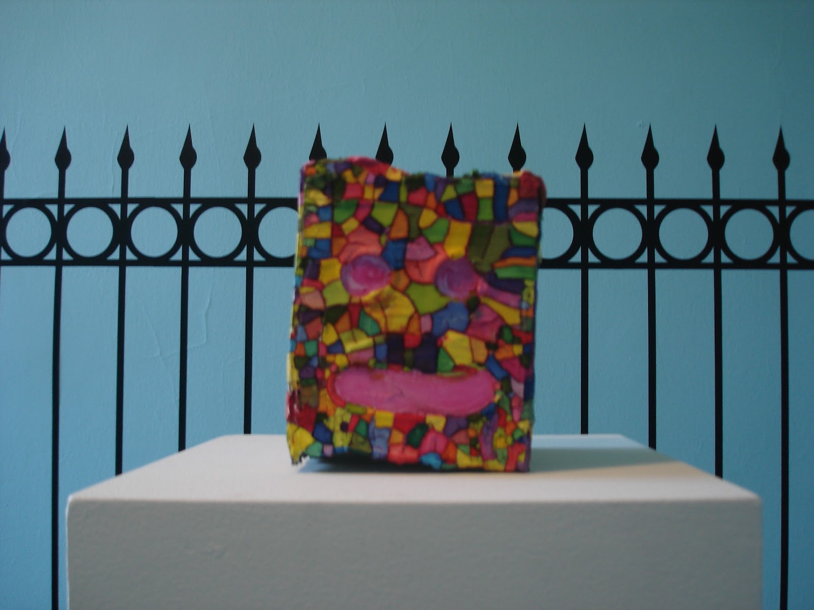
I was asked recently to give a talk about my work so I spent some time digging out old treasures and photographing them today. These works from around 2002 - 2004 are from just before I went to grad school. 


Back then I was very comfortable being a "student of a student" of the New York post-ab-ex figurative school, painters that called themselves (or were called by others more likely) the 10th Street painters. Louisa Mathiasdottoir, Leland Bell, Rosemarie Beck, etc, many of whom are in this curious show at Schroeder Romero & Shredder: http://srandsgallery.com/index.php?/exhibitions/spring_summer_fall_winter 


As a student I was, and still am a fan of Jean Helion, a man who participated in the development of early modernist French abstraction in the late 1930's. Shortly after he made some very impressive machinist abstractions he went off to fight in WWII. The war ended and bits and pieces of European culture went their way. Many art and culture producers made their way back into the fabric of life that existed before the war. Much like Andre Derain after the first world war, post-WWII Helion rejected modernism in his own way (I should say reacted to modernism in his own way, because neither Derain or Helion fully rejected modernism). However, unlike Derain's conservatism Helion's return to the figure, and to urban and suburban French culture (he painted a lot of flea markets) is marked by fierce color, and prescient juxtapositions of ideas and images.


He clearly saw the absurdity of post war Parisian life in this painting from the early 50's. So strange that this man should be napping in front of a store called "golden". Is it some golden slumber, is he homeless? Was he drunk last night and now at 7 am about to wake to the cruel fate of hobbling home with only one shoe, aided by an umbrella? In most every instance it doesn't really matter, the painting makes it's own kind of sense. 


One of the reasons I admire Helion as an artist is his stylistic gear shifts, his chameleon like investigation into how to paint. It's almost as if every decade or so he got bored and decided to test his audience by switching styles. There's no transition period between painting loosely stylized figures to wildly colored street scenes to 10 years of intensely realized, highly detailed studio interiors. My inability to understand and come to terms with his motivations for this keep me invested in his weird flat footed alchemy.


This table of leftover junk, which became a motif of his in the early 70's, is maybe one of the best commentaries on late industrial culture by a French painter of the period. It's a cloud of discarded hand-me-downs, probably collected on a studio table and char. Spatially the objects sit together somewhere, but where? In some grey-green funk, to look means to have to pass through electric pink miasma. Despite his aesthericization of the abject I can't help but see some connection to the work of American artist Mike Kelley, who made work about the discarded and ignored parts of his particular culture beginning just a decade hence. 

Which is maybe a reminder that our culture will be defined (if anyone is around to define it) as much by our trash as by our treasures. Some anthropologist will come along and theorize on our own lives, pick through our trash, measure our bones and write theses about her findings. Helion's reputation, as far as I can tell, is far beyond the cultural trash can, it's undeservedly buried deep in a dump.


Speaking of anthropology and culture, I have a really great, well illustrated book on Helion that I can't read because it's written in French and I understand very little of that language I once studied in High-School. Thankfully there's lots of pictures to look at.


Monday, January 23, 2012

January is getting away from me now, and I promised I'd at least do this monthly. I've been sitting on a long essay on how I feel about arts education, specifically grad school for a month or more. I thought I'd post it for January but I'm uncomfortable with about 50% of it, so it waits. Here instead are some recent paintings that you'll have a chance to see in person soon, if you live in New York and frequent new Bushwick galleries that call "the Bogart" home.

By way of explanation: I was about half way through this series of paintings based on avatars and emoticons when I realized they didn't have names. In the past I've always settled on "untitled" to name my work, but that was getting old, an artist can only have so much work that is untitled. So to give a bit of narrative thread to this group of 70 paintings I decided to look for a list of some sort.

Given the nature of the paintings I was looking for a particularly colorful list. I found my colorful list in a particular subset of pop culture, marijuana nomenclature. Weed growers are particularly proud of their progeny and give the strains pretty names like Bubblegumcrack and Rasberrycough. So I stole their names.

Here are four recent paintings.

Chris Moss, BC Blue Cheese, 2011, 10 x 10 inches

Chris Moss, Chesus, 2011, 10 x 10 inches

Chris Moss, Somalicious, 2011, 10 x 10 inches

Chris Moss, Yumboldt, 2011, 10 x 10 inches

Sunday, November 20, 2011

It's almost December and I haven't posted anything for the month of November. I've been a bit busy, making drawings for a drawings show (see Two Coat's of Paint).

I've also got a show opening in Philly at Grizzly Grizzly called Southern Cross.

Here are some recent drawings and paintings.


Monday, October 24, 2011

Governor's Island Art Fair Proposal and Installation


An actual proposal I sent to a museum in South Carolina, with drawings and photos of the recent GIAF Install


Christopher Moss
1979 Bedford Avenue #2
Brooklyn, New York 11225
htp://christophermoss.neoimages.net
646 671 XXXX

Proposal:

The nine drawings and several documentary photographs included in this proposal are examples of how I could alter an exhibition space with a sculptural installation. The work takes imagery and ideas from my paintings and renders them in three dimensions.

The first installation of this work was a part of the Governors Island Art Fair, a yearly event that takes place in an old coast guard barracks on Governors Island, just off the lower tip of Manhattan. The decommissioned operations base was turned over to the people of New York in 2003 and since 2008 has been host to a growing and changing city park, historic landmark and a cultural events destination. Governors Island's designation as New York's newest public park became the core of my installation, a park within a park and an ode to parks everywhere.

More than just an inside-out room the installation provides a different context to situate painting. The sculpture, fence, blue sky and astroturf in the space mimics the depiction of a sculpture in the painting on the wall. Sculpture then becomes a kind of recursive painting, the room becomes a deadpan painting of itself. Other possible iterations of this basic theme can be seen in the 9 drawings I've included in the image portion of this proposal. A future installation would, like the Governors Island piece, take into account it's surroundings as well. It would become an ode to Charleston I suppose, a place I once lived near and visited a number of times.


Artists Statement:

Through my work I attempt to examine the phenomenon of Papa Smurf as a metaphorical interpretation of both John Wesley's paintings and Andalusian sensibilities. What began as a personal journey has translated into images of spinach and toe that resonate with white people to question their own light blueness. My mixed media technique embodies an idiosyncratic view of ________, yet the familiar imagery allows for a connection between Harpo Marx and the Unicorn Tapestries.


Biography:

Christopher Moss is an artist living and working in Flatbush, Brooklyn. He is a recent recipient of a grant from Folsom Prison where he served time for stealing mugs and tie clips from the gift shop of The Mutter Museum in Philadelphia. Moss has exhibited in group shows at the local Piggly Wiggly and Shaheen Fine Art in Cleveland, Ohio and, more recently, had his first solo exhibition in February of 2011 at the AFA Gallery in Scranton, Pennsylvania. Moss is a regular reader of Artforum, October, Art in America, and Frieze. He graduated with a BFA from Marywood University in 2000 and he received an MFA from CUNY Brooklyn College in 2006. He fancies himself a comedian albeit perhaps a not-very-funny one in the “LOL” sense. His artist statement was written with the help of an artist statement generator he found on the website 10gallon.com, which is to say it's mostly made up but not entirely inaccurate.

Wednesday, August 31, 2011

a confession, or a rug about a painting for a loby about an art exhibition, or something like that.

Recently I was invited* to participate in an exhibition that will take place in a lobby on 27th street in Chelsea. The curator mentioned he was thinking of making the lobby show about lobbies. I proposed to make a doormat for the exhibition. I had a plan I thought would be kind of funny, a photographic reproduction of one of my paintings on a doormat, and this is the painting I chose to use. 

*I feel like I invited myself after interjecting in a twitter conversation that I'd made art about a bathroom before, which is true.


At 24 x 24 inches I knew from research it would be unsuitable for a 24 x 36 inch rug, so I cropped the image.


Still, I was unsatisfied with this result, as a rug it's the kind of thing only a mother (or in this case the artist who made it) could love. I'd found a few websites from which I could order any photograph on a door mat. All of the examples given on each of those websites were of people's pets or babies or crazy drunk uncles. Photos of pets on rugs, what could go wrong? 


I hadn't really created something new, the photo of a painting on a rug seemed undigested, unprocessed and I thought it looked too much like very obvious product placement. 

I'd only taken something (a painting) and done something to it (printed it on a rug). I still needed to do something else to it, at least according to the oft quoted (ad nauseum) Jasper Johns dictum. I don't believe in dicta or art-making checklists but my instincts told me to keep pushing this idea further. My instincts often tell me to shoot myself in the foot, repeatedly, and the results are either surprisingly great or terribly disappointing. Both outcomes are desirable, really.


Next step: I reduced the file size of my image to 24 x 36 pixels. Ordinarily reserved for editing digital photographs of paintings, I've been using photo editing programs for a while now; only recently have I been making such use part of my studio process (more on this later perhaps). 

Now I had an image that was it's own thing, a little less connected to the source. A little more "about" the source. Clever (rolls eyes).


But I kept playing. Unsatisfied with what looked to me like an idea straight out of freshman level 2-D design class. I sharpened the colors more, I sharpened the colors until I could sharpen no more, the whole image reduced to basic CMYK printer's colors. I was destroying the image, completely obliterating any real reference to the source material. This was beyond clever, this was just plain stupid. But this whole idea of obliteration leading to creation is also deeply imbedded in both Modernist and Post Modernist cannons. (And really it's not that new of an idea at all, creation = destruction is evident in all art making).


Next I had to translate CMYK to RGB because that was closer to the palette of fabric dyes they use in manufacturing rugs. The first proof they sent me was awful, based as it was on the above CMYK color profile, everything about it was wrong. 


Now that looks like a rug. Below is the proof they sent back, it's cute how they photoshop it into a real life scenario.


And below, at long last, is what I just got from the UPS guy, delivered for free, an edition of 10 (plus an artist proof) personalized rubber backed door mats. 


And this is all I have to say about this exercise. A pretty door mat. 

Thursday, August 18, 2011

I've been working for the past couple of months on this new series, based on a painting and a whole lot of drawings that have been kicking around the studio for a couple of years now. It's nice to be able to work like this, since matriculating grad school in 2006 I've been in full on mad person mode, changing everything, flipping over rocks to see whats on the underside. Five years on I think I'm in a good place, finally comfortable with the new work and new ideas, finally able to guide the work instead of letting the work guide me.


Ayatollah, acrylic on masonite, 2011, 10 x 10