*I feel like I invited myself after interjecting in a twitter conversation that I'd made art about a bathroom before, which is true.
At 24 x 24 inches I knew from research it would be unsuitable for a 24 x 36 inch rug, so I cropped the image.
Still, I was unsatisfied with this result, as a rug it's the kind of thing only a mother (or in this case the artist who made it) could love. I'd found a few websites from which I could order any photograph on a door mat. All of the examples given on each of those websites were of people's pets or babies or crazy drunk uncles. Photos of pets on rugs, what could go wrong?
I hadn't really created something new, the photo of a painting on a rug seemed undigested, unprocessed and I thought it looked too much like very obvious product placement.
I'd only taken something (a painting) and done something to it (printed it on a rug). I still needed to do something else to it, at least according to the oft quoted (ad nauseum) Jasper Johns dictum. I don't believe in dicta or art-making checklists but my instincts told me to keep pushing this idea further. My instincts often tell me to shoot myself in the foot, repeatedly, and the results are either surprisingly great or terribly disappointing. Both outcomes are desirable, really.
Next step: I reduced the file size of my image to 24 x 36 pixels. Ordinarily reserved for editing digital photographs of paintings, I've been using photo editing programs for a while now; only recently have I been making such use part of my studio process (more on this later perhaps).
Now I had an image that was it's own thing, a little less connected to the source. A little more "about" the source. Clever (rolls eyes).
But I kept playing. Unsatisfied with what looked to me like an idea straight out of freshman level 2-D design class. I sharpened the colors more, I sharpened the colors until I could sharpen no more, the whole image reduced to basic CMYK printer's colors. I was destroying the image, completely obliterating any real reference to the source material. This was beyond clever, this was just plain stupid. But this whole idea of obliteration leading to creation is also deeply imbedded in both Modernist and Post Modernist cannons. (And really it's not that new of an idea at all, creation = destruction is evident in all art making).
Next I had to translate CMYK to RGB because that was closer to the palette of fabric dyes they use in manufacturing rugs. The first proof they sent me was awful, based as it was on the above CMYK color profile, everything about it was wrong.
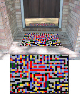
Now that looks like a rug. Below is the proof they sent back, it's cute how they photoshop it into a real life scenario.
And below, at long last, is what I just got from the UPS guy, delivered for free, an edition of 10 (plus an artist proof) personalized rubber backed door mats.
And this is all I have to say about this exercise. A pretty door mat.


No comments:
Post a Comment